Appearance and Themes
Open "Settings" > "General Settings" to change the theme, or "Settings" > "Display Settings" to adjust the toolbar and popup appearance and behavior.
Theme Modes
- Light: Always uses the light theme
- Dark: Always uses the dark theme
- System: Follows the system appearance
- System (Inverse): Uses dark when the system is light, and light when the system is dark
System modes update automatically when the system appearance changes.
Use a Custom Theme
TextGO accepts theme CSS generated by the daisyUI Theme Generator.
- Create a theme in the generator
- Click the "{} CSS" button to copy the CSS
- In TextGO, open "Settings" > "General Settings"
- Under "Custom Theme", select "Custom Light Theme" or "Custom Dark Theme"
- Paste the complete
@plugin "daisyui/theme" { ... }block and click "Confirm"
The light and dark editors override their corresponding built-in themes. "System" and "System (Inverse)" also use these overrides after resolving to light or dark.
TIP
Clear an editor and confirm to restore the built-in theme.
Toolbar Settings
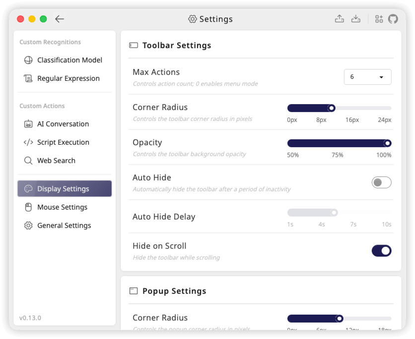
Open "Settings" > "Display Settings" and configure the following under "Toolbar Settings":
| Option | Description |
|---|---|
| Max Actions | 0–12, default 6; extra actions appear in the "More" menu, while 0 opens menu mode directly |
| Size | Small, Medium, or Large; defaults to Medium and scales icons, text, and buttons together |
| Position | Top, Top Right, Right, Bottom Right, or Bottom; defaults to Bottom Right |
| Position X Offset | −200 to 200 pixels, default 0; positive moves right and negative moves left |
| Position Y Offset | −200 to 200 pixels, default 0; adjusts the vertical offset according to the selected position |
| Corner Radius | 0–24 pixels, default 8 |
| Opacity | 50%–100%, default 95%; lower values make the background more transparent |
| Auto Hide | Off by default; hides the toolbar after the configured period of inactivity |
| Auto Hide Delay | 1–10 seconds, default 5; applies when Auto Hide is enabled |
| Hide on Scroll | On by default; can be disabled |
Mouse triggers position the toolbar relative to the pointer. Keyboard triggers use the selection location reported by the system, falling back to the pointer when that location is unavailable. Placement adjusts near screen edges to keep the toolbar visible, so its actual position may differ slightly from the selected direction.
Position offsets are added to the selected placement. For Top and Top Right, a positive Y offset moves the toolbar up; for Right, Bottom Right, and Bottom, it moves down. Negative values reverse these directions. For example, with Bottom Right selected, X = 20 and Y = 30 move the toolbar 20 pixels farther right and 30 pixels farther down. Set both offsets to 0 to restore the default placement.
Popup Settings
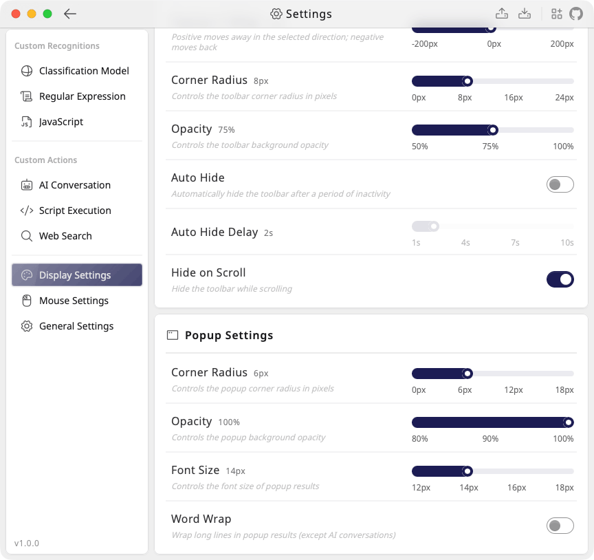
The "Popup Settings" section on the same page provides:
| Option | Description |
|---|---|
| Corner Radius | 0–18 pixels, default 8 |
| Opacity | 80%–100%, default 100% |
| Font Size | 12–18 pixels, default 14; applies to result content, including AI responses |
| Word Wrap | Off by default; wraps long lines to the window width in non-AI popup results only |
Non-AI results can be edited in the popup. Use "Reset Content", "Format", "Copy", or "Insert" as needed. "Insert" sends the current result back to the source app to replace its selection and leaves the inserted text on the clipboard. For AI response controls, see Call an LLM API.
Drag the title bar to move the popup, or its edges to resize it. The window size is remembered across app restarts. By default, the popup hides when it loses focus; use the pin in the upper left corner to keep it open.